The Logo
New Brand image:
The original logo was drafted and designed with the vision of presenting clean, edgy and contemporary image while distinguishable amount all the logos on the team uniform. In 2018, we feel that it is time to turn the page to the next new chapter and refine the look which reflects our position in the market. Our new logo will also pave our future plan on the brand service and product lines. In order to achieve this plan, we teamed up with designer You Bo (eight Bs Design) from Japan who is also an avid cyclist and triathlete.

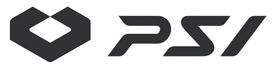
We first looked at how to improve the existing letter mark logo and it is by refining the corner and adjusting the angles on the lines. Rounding some corners allowed us to make the logo look less harsh and it feels more welcoming to the eyes. In line with this, adjusting the angle of the lines enables the letter more defined and consistent.


We then created a logo mark which truly expresses who we are. Using the arrow, it emphasized our way of forward thinking. We then decided to design around the word “TRI”. Three of everything such as our founders were from three different countries (Japan, Philippines, Taiwan), our specialty is in triathlon apparel (Swim, Bike Run), and even our brand name has three letters!
In line with this, we want to be the 3rd layer of support for our team and athletes as the first and foremost layer being the athlete himself. Secondly, his friends and family guiding the athlete. Last but not the least is us, PSI, putting all three layers together with the evidence of protection and support that we provide, confidence would be seen from the athlete. From this, we ensure to achieve our vision and goal.

